Launching ReTech’s online ordering: saving restaurants from delivery-app fees
ReTech’s ordering suite allows restaurants to bypass the 18%–30% commission that Uber Eats and DoorDash take on every sale. Owners launch a branded site on their domain, manage menus in minutes, and keep guest data in-house, gaining margin and loyalty at the same time.
2 Product Managers
25 Developers
I lose nearly one-fifth of every online order to delivery app fees.
I need a way to keep more of my own revenue.
Why this product?
Restaurants forfeit 10%–30% of every online sale to delivery apps such as Uber Eats, DoorDash, and Grubhub, even though their operating margins often sit below 5%. Those commissions erode profits, distort menu pricing, and leave owners with limited control over guest data and brand experience. ReTech’s white-label ordering suite addresses that pain by allowing restaurants to accept direct web and mobile orders under their name, keeping customer information in-house, and integrating loyalty or promotional tools with the same platform that already runs their back-office tasks. The product restores lost revenue to operators while reinforcing ReTech’s position as the single, end-to-end system for modern restaurant operations.


Learnings from research
Simple Setup
Restaurant staff find the complex onboarding experience delays the launch and drains their energy.
Brand Visibility
3rd party services use one-size layouts that lack branding functionality, leaving owners feeling anonymous.
Menu Upkeep
Editing items and prices is slow and error-prone, so daily specials and price changes lag behind reality.
Interface Clarity
Customers abandon the flow when screens feel crowded or navigation is unclear.
Promotions & Loyalty
The absence of built-in deals or rewards limits repeat visits and average order value.
Real-time Status
Diners expect live order tracking; without it, confidence drops and support calls rise.
How might we create an online ordering portal that simplifies setup, offers customization, and supports restaurant owners and managers effectively?
Project Goals
Simplify onboarding and setup
Enhance branding and customization
Cater to tech-savvy and non-tech-savvy users
Ensure scalability for future features
Key Metrics
Setup Completion Rate
Engagement Metrics
Support Requests
Alex Chen
Alex orders lunch online three to four times a week to keep pace with his consulting schedule.
Jobs to be done
- Place an order in under one minute
- See transparent prices before checkout
- Pay with Apple Pay, Google Pay, or a saved card
- Track prep and delivery in real time
Frustrations
- Different layouts and logins at every restaurant
- Checkout flows that force account creation
- Delivery estimates that jump or vanish
- No live help when an order goes wrong
Habits
- Shops on his phone first and laptop at the office
- Uses stored wallets by default
- Skims quickly and abandons slow pages
Tools
- Mobile phone
- Laptop
Persona 1
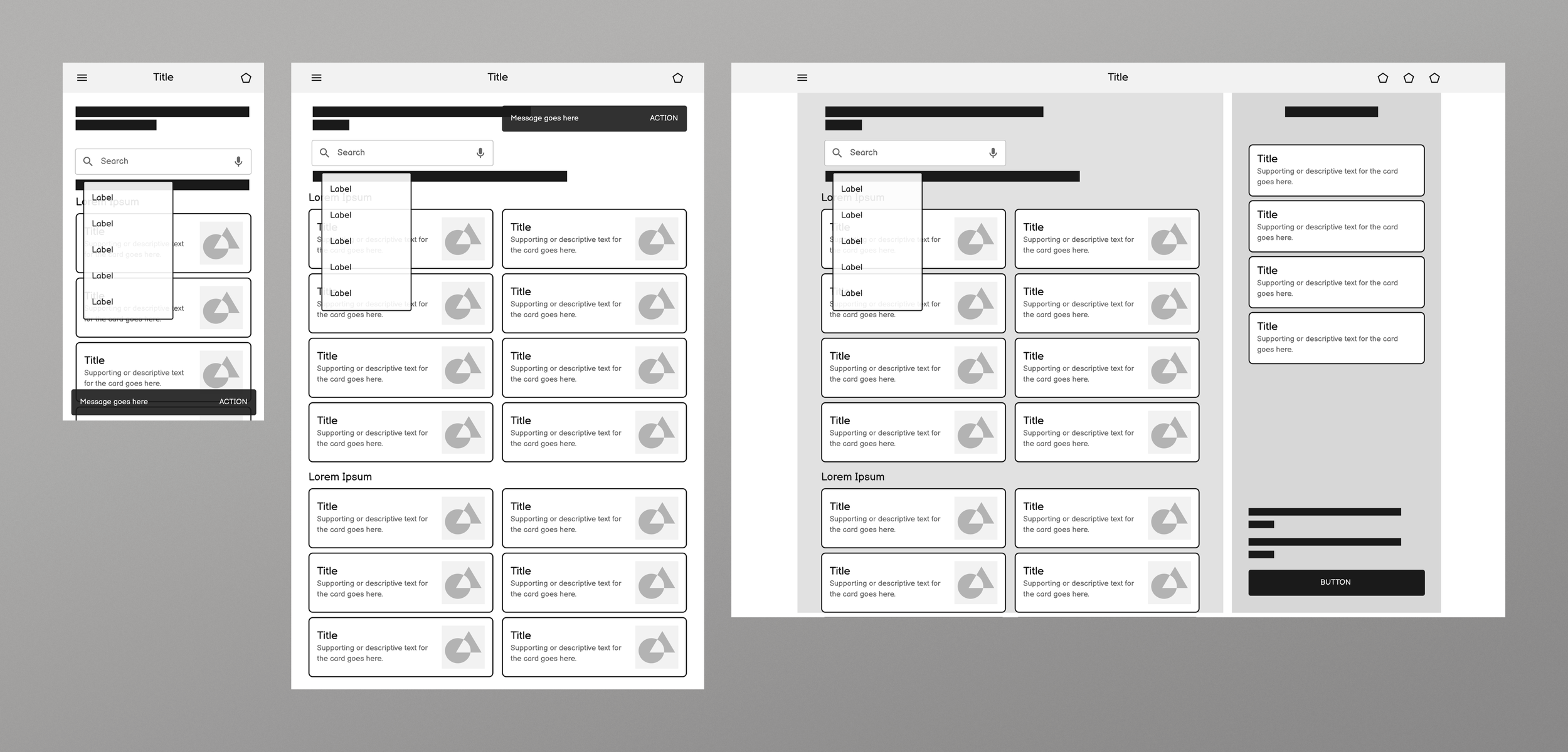
Menu architecture
Restaurants organize food in wildly different ways. To design a system that works for a corner café and a fast casual, I first mapped a universal hierarchy that every menu could fit into.
Structure the information
Menus begin with a master catalog, then are divided into categories such as Starters or Drinks. Each category contains items, such as Burger, Latte, and Caesar Salad. Items branch into variations (Small, Medium, Large; hot or iced), modifier groups (Toppings, Sides, Milk), and specific modifiers such as extra cheese or soy milk. This six-level hierarchy accommodates any menu while maintaining flexible layouts, accurate prices, and a smooth checkout process.


Testing the model
I stress-tested the six-level hierarchy by mapping Blue Bottle Coffee’s entire menu into it. Seasonal drinks, milk options, and extra-shot add-ons all slotted in cleanly, confirming the structure’s range. The resulting schema lets merchants update prices or launch new items without workarounds, keeping menus current as offerings evolve.

Mapping the end-to-end flow
When I began designing the consumer side, I first charted the complete journey, from choosing order type to receiving confirmation. Plotting every step exposed four verticals: Ordering, Checkout, POS integration, and Notification. Revealed where hand-offs between systems could break, especially at POS sync and account creation.

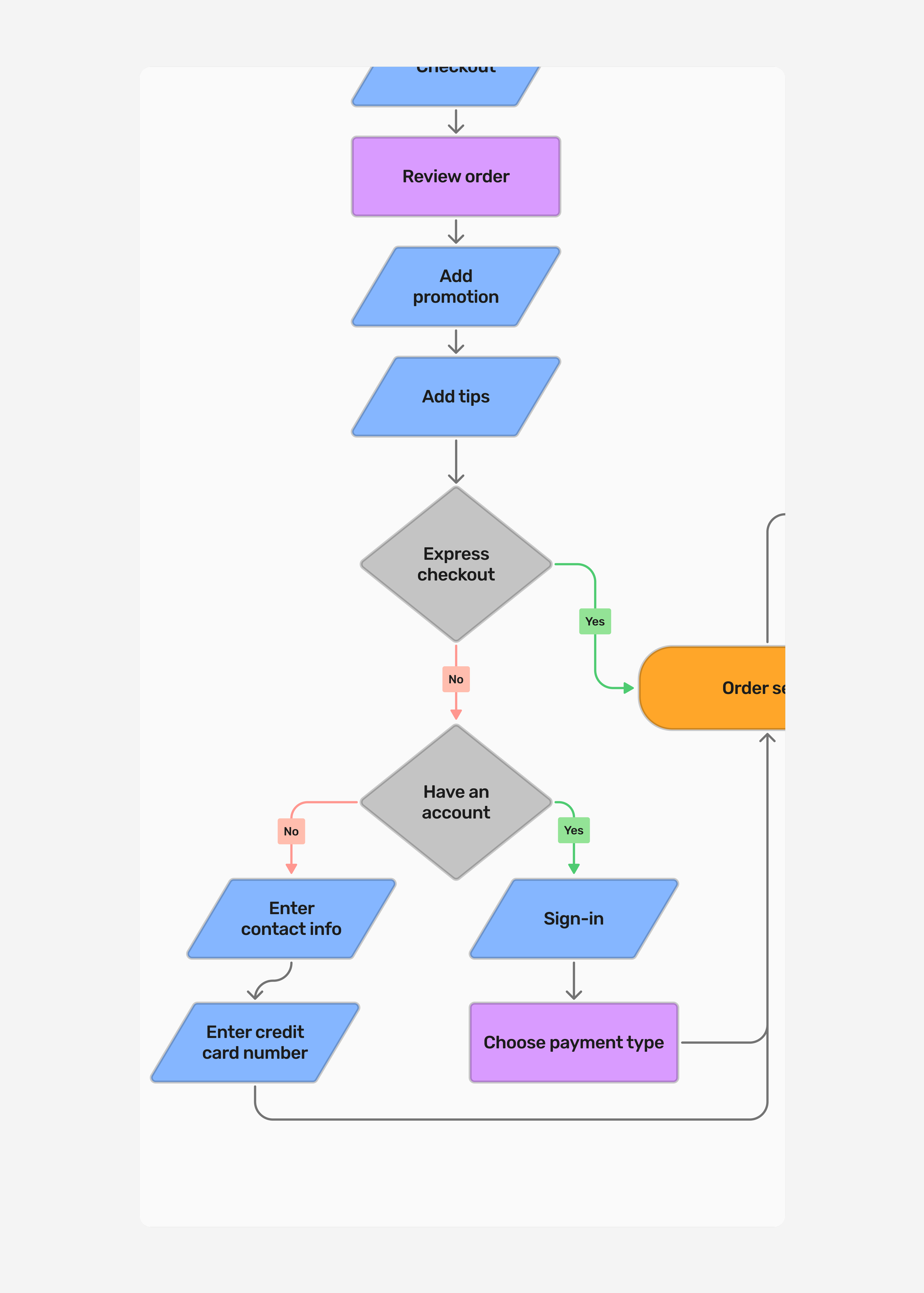
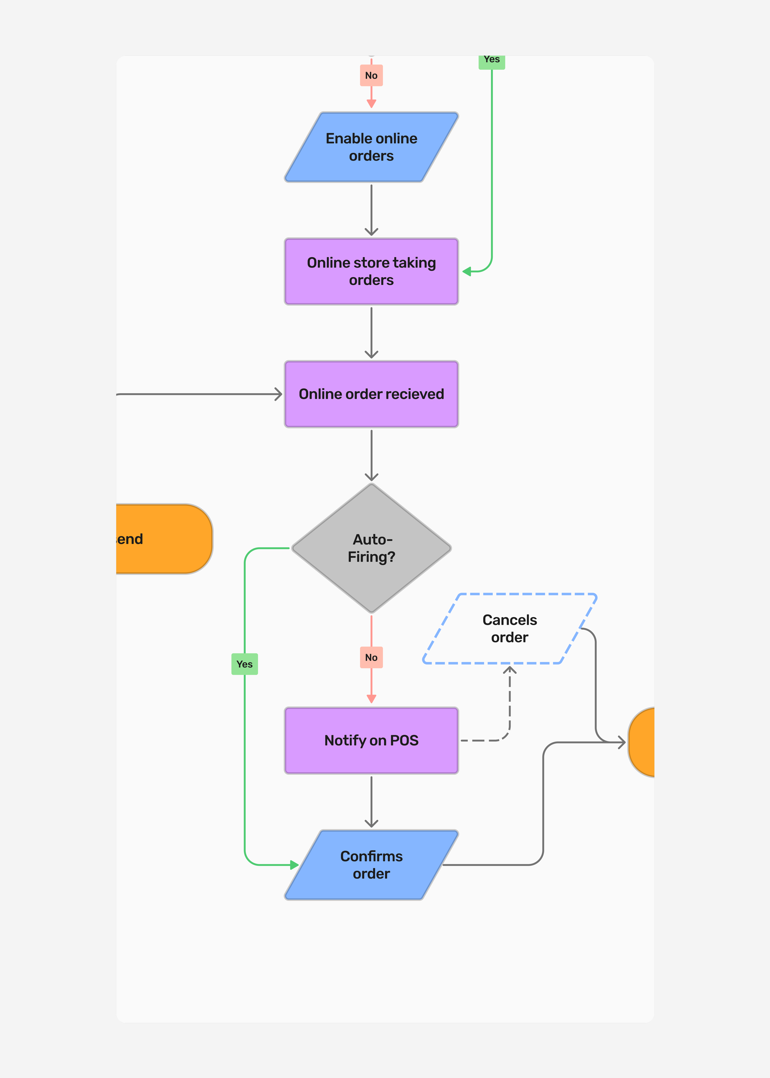
Stress-testing decision branches
Layering in express checkout, sign-in, auto-firing, and cancellation paths added new branches. I walked through these diagrams with PMs and engineers early on, validating the logic before designing. The exercise surfaced fallback needs, clarified edge cases, and allowed me to iterate on a single flow, such as checkout, without breaking the larger experience.
Refining the ordering page
The first design opened with a branded landing view before the menu. Usability sessions showed most diners wanted to skip straight to food, and traffic data confirmed that more than eighty percent of orders were coming from phones. I re-worked the entry to load the menu first, then added a single Order Preferences panel where guests choose pickup or delivery, time, and location in one step. The change cut clicks to checkout, handled every restaurant configuration, and lifted task-completion scores in follow-up tests.
1. Brand-First concept
2. Menu-first pivot


3. Order preferences hub
Mobile-First Responsive Design
Ninety percent of orders come from mobile devices, so I designed the experience with mobile users in mind. Every component scales fluidly up to a ten-inch tablet, which covers customers who browse on a larger device at the counter. The ordering flow, navigation, and visual hierarchy remain consistent across all screen sizes. Usability tests revealed no drop-offs when users switched between phones and tablets, and checkout times remained within five seconds across devices.

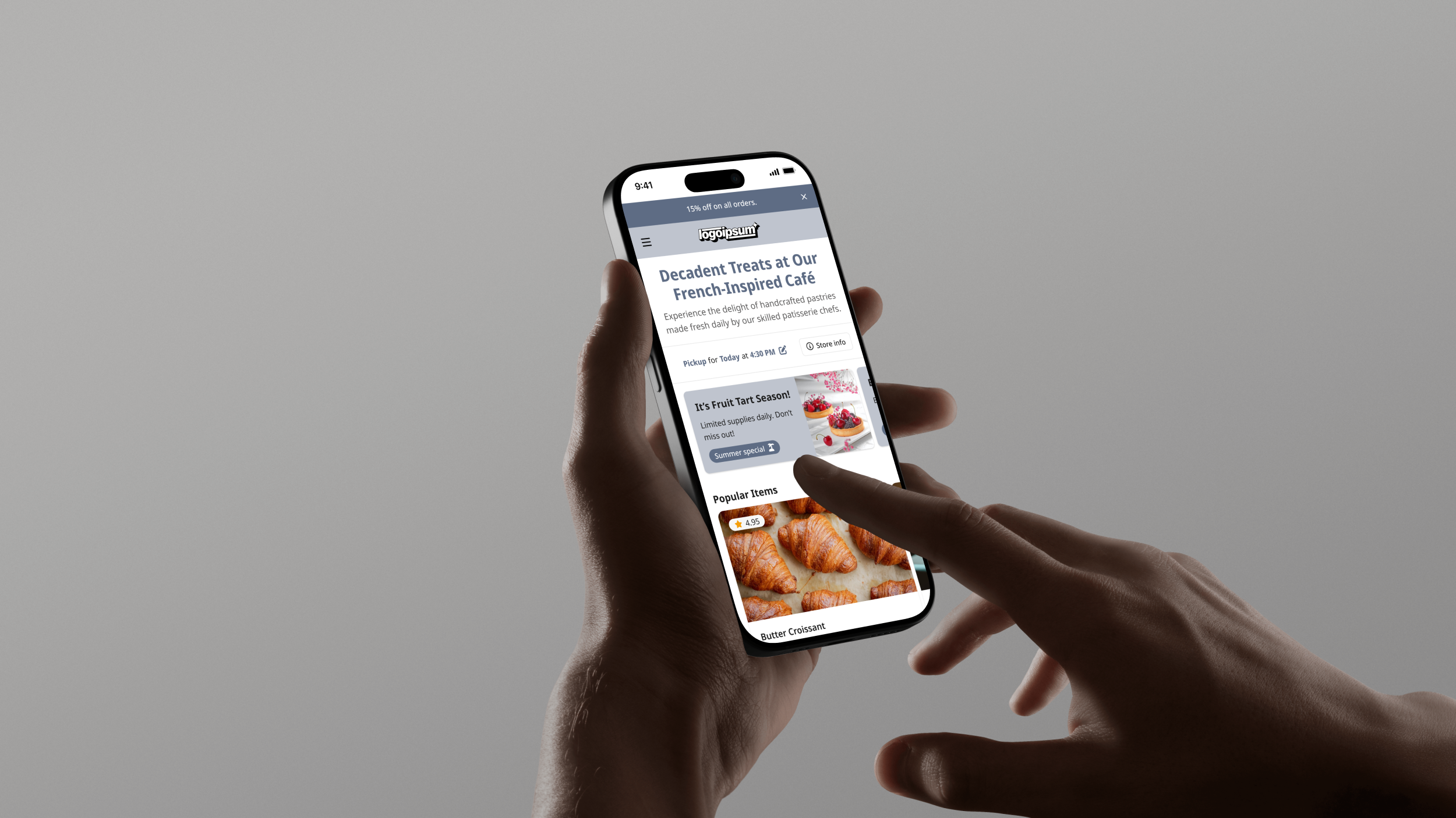
Landing page
A modular hero and product grid introduce the brand without blocking sales. Merchants mix and match banners, featured items, or promos, while diners can start scrolling the menu immediately. This flexible shell keeps page weight light and branding on point across cafés and chains.

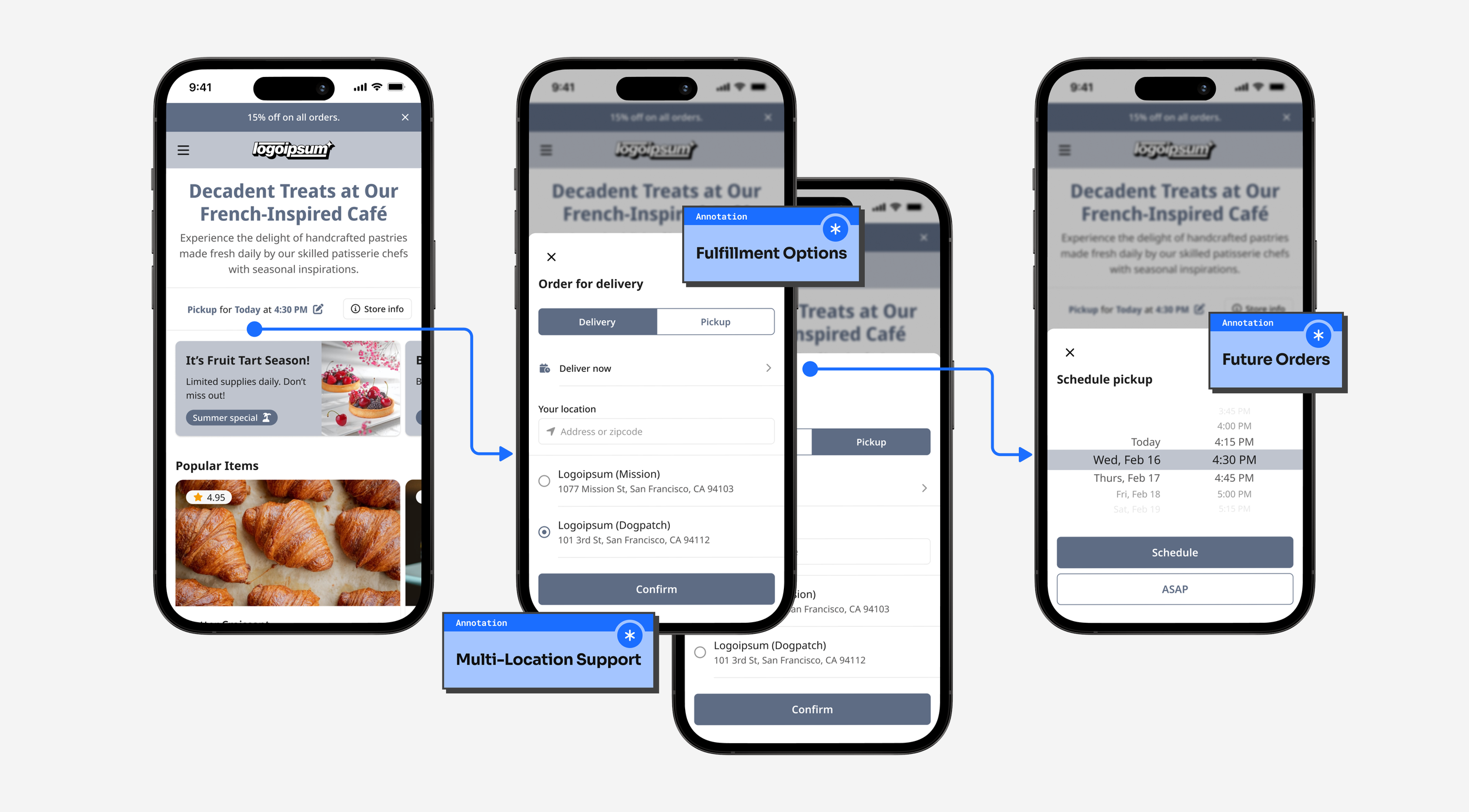
Order preferences
One panel handles every fulfillment rule: pickup, delivery, multiple locations, and scheduled orders. Placing all options in a single overlay reduces decision time and eliminates edge-case logic from the core flow, making the system easier to maintain and quicker for guests.
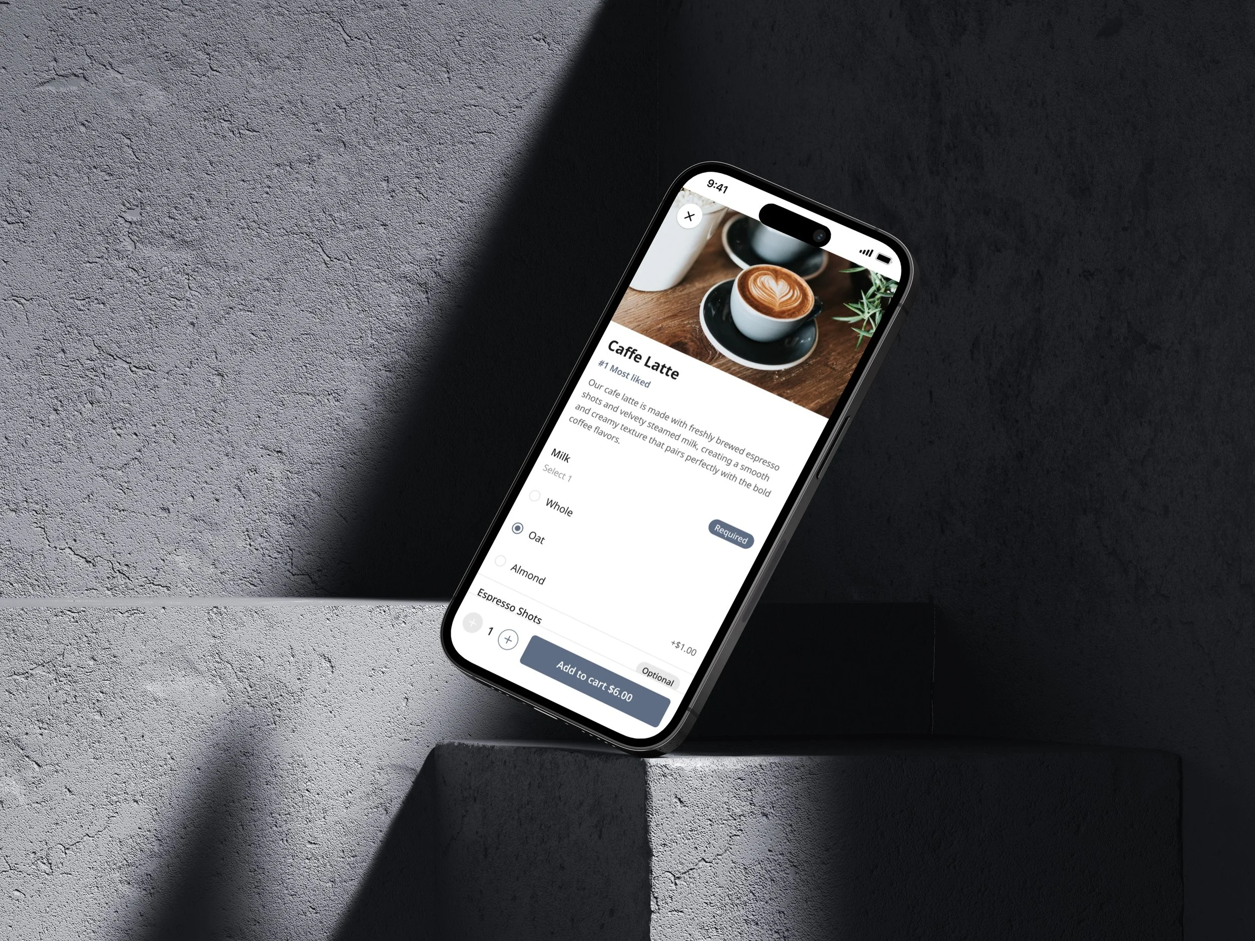
Ordering and item modifiers
The menu card opens to a focused detail view, then expands into a scrollable modifier sheet where users add milk types, sugar levels, or extra espresso shots. Quantity controls and price changes are displayed in real-time, striking a balance between choice and operational simplicity.

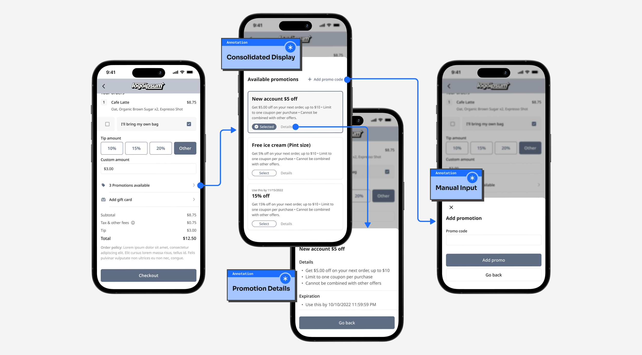
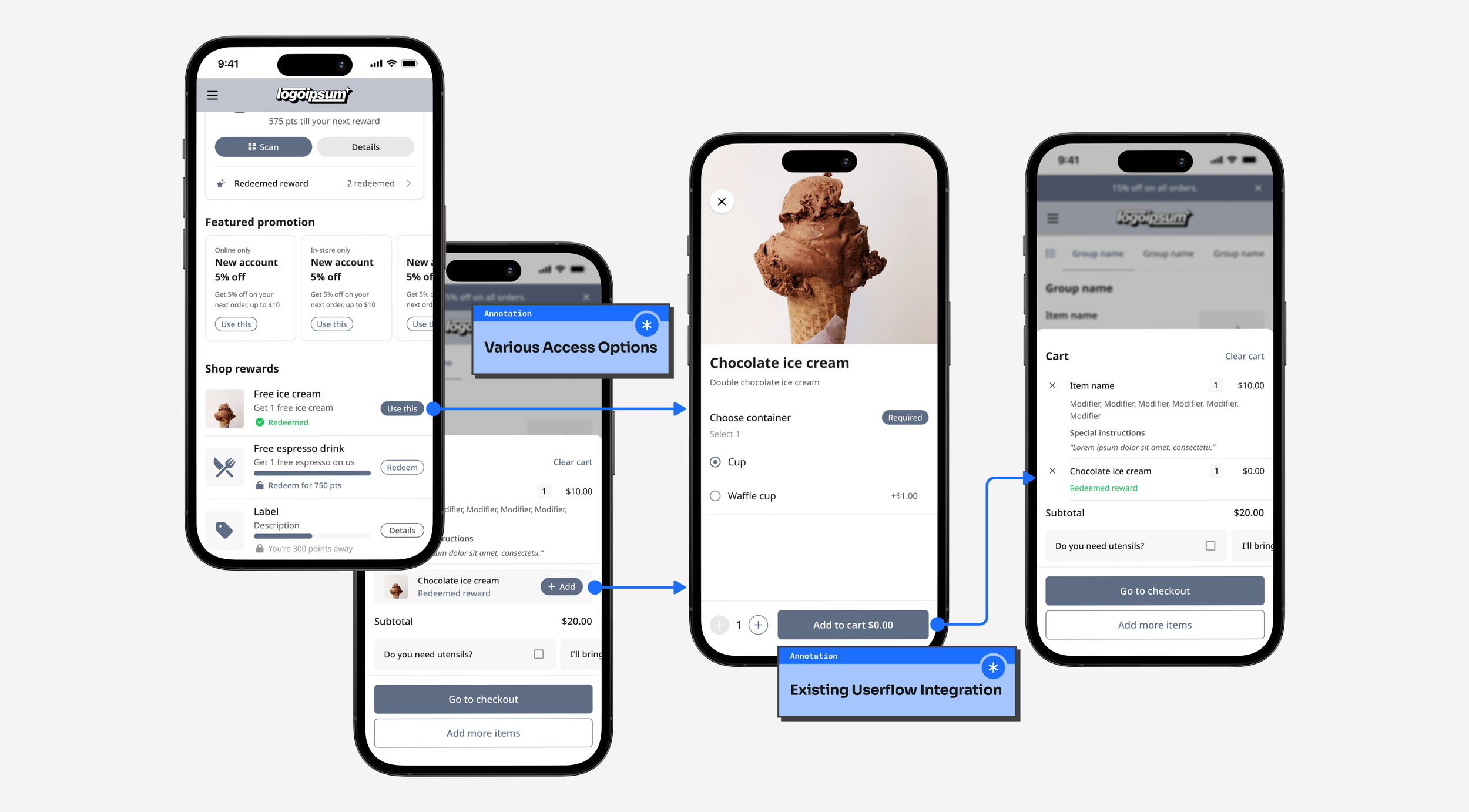
Checkout and placing order
Cart, tip, payment, and instructions sit in a single view. Express buttons for Apple Pay and Google Pay shorten the path for repeat customers, while a clear “Other” route covers card entry. Tests showed a thirty-seven percent drop in abandonments once the flow moved to this layout.

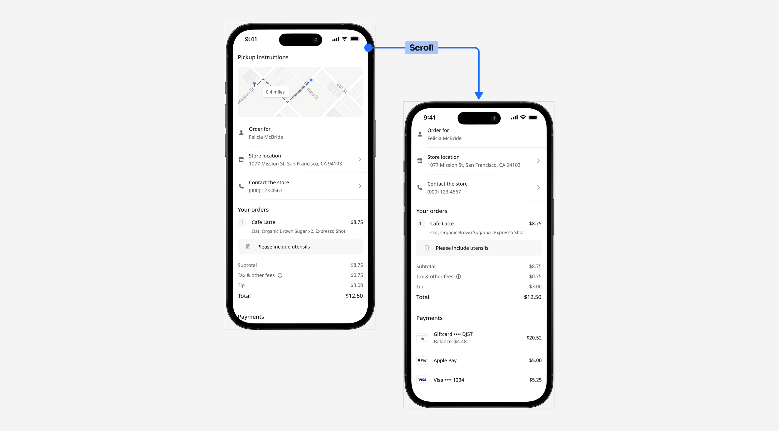
Order confirmation
The receipt doubles as a help hub. Customers can view store information, call the location, or review payment details all in one place. A scroll prompt signals more content, preventing missed information on long orders.
Order status
After checkout, diners receive a live progress bar through SMS and on-site tracking. Real-time updates reduce “where is my order” calls and build trust without extra work for staff.

Points and rewards
A point-based loyalty system enables restaurants to offer free items, tiered perks, or targeted deals. Rewards are displayed in a dedicated tab, appear in the cart when redeemable, and are logged in a history view. Hence, guests always know their balance, driving repeat visits without requiring support tickets.

Friction free redemption
Guests can browse available rewards from a dedicated tab or spot a prompt in the cart. No detours, no codes, just one tap from perk to plate.
One-tap savings
A single panel lists every active offer. Diners can select to apply or type the promo code in the same view. Promotional details are shown as a popup, without overcrowding the checkout view.